Why Color Psychology Still Matters in 2025
Here’s what we know:
People form judgments about a product or brand within 90 seconds—and up to 90% of that judgment is based on color alone.
Color increases brand recognition by up to 80%.
In a market saturated with minimalist templates and AI-generated content, emotional resonance is what separates smart brands from forgettable ones.
That’s why brands that get color right tend to build faster trust, stronger loyalty, and more compelling brand stories.
What Each Color Signals (and Who’s Using It Well)
Here’s a quick-hit breakdown of core brand color meanings—and who’s owning them in 2025.

Blue — Trust, Stability, Professionalism
Best for: Tech, healthcare, finance, wellness
2025 trend: Muted, mid-toned blues mixed with soft grays for a more human feel
Brands doing it right: Notion, Calm, Chase
Use it when: You want to convey reliability, calm, or expertise

Green — Growth, Sustainability, Balance
Best for: Wellness, food, environment, coaching
2025 trend: Sage, eucalyptus, and dusty greens feel grounded and less cliché than bright green
Brands doing it right: Ritual, Wild One, Thorne
Use it when: You want to feel fresh, holistic, or eco-conscious
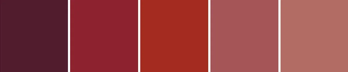
Red — Energy, Passion, Power
Best for: Food, entertainment, fashion, bold startups
2025 trend: More nuanced reds—think terracotta, brick, and oxblood—are replacing primary red
Brands doing it right: Glossier’s product design, DoorDash
Use it when: You want to spark action or stand out boldly

Yellow — Optimism, Youthfulness, Creativity
Best for: DTC brands, education, lifestyle
2025 trend: Soft ochres and warm mustards feel elevated over neon or school-bus yellow
Brands doing it right: Mailchimp, Ban.do
Use it when: You want to feel sunny, quirky, or playful

Black/Grey — Sophistication, Luxury, Authority
Best for: High-end brands, fashion, consulting, tech
2025 trend: Matte blacks with soft beige accents for modern contrast
Brands doing it right: Aesop, Apple, Celine
Use it when: You want a high-end or minimal, timeless look

Purple — Creativity, Luxury, Spirituality
Best for: Beauty, coaching, personal brands
2025 trend: Mauve, plum, and periwinkle over saturated violet
Brands doing it right: Evernote’s new palette, Olaplex
Use it when: You want to balance femininity with boldness
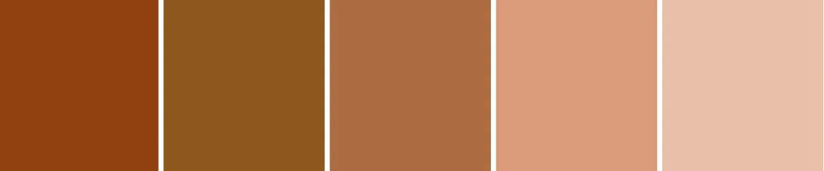
Orange — Energy, Innovation, Approachability
Best for: Startups, SaaS, lifestyle brands
2025 trend: Earthy oranges like clay and copper feel more elevated than bright tangerine
Brands doing it right: Etsy, Headspace
Use it when: You want to feel upbeat, creative, or community-driven
What’s Trending in 2025: Modern Color Moves
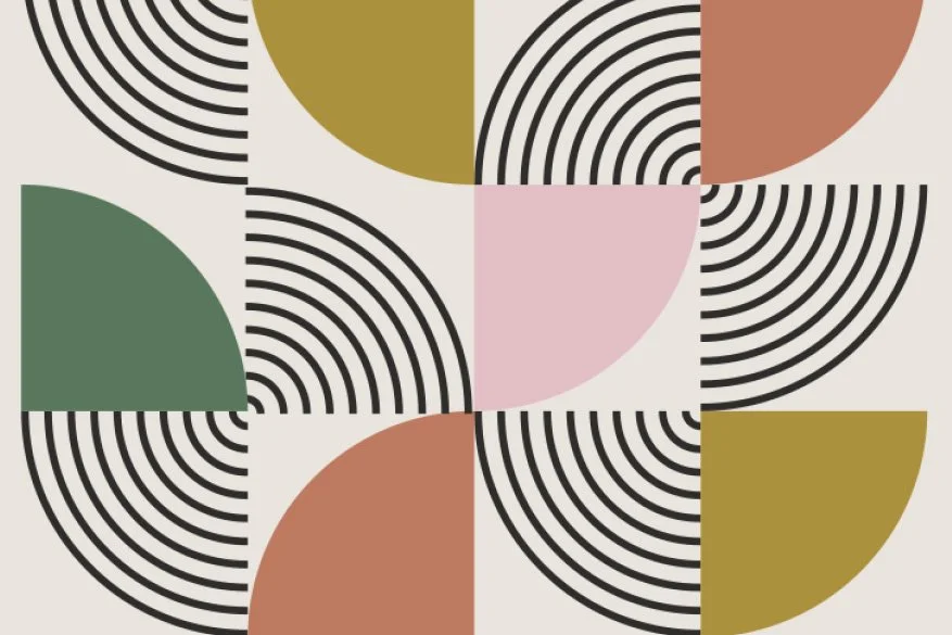
✅ Softer, Dustier Tones
Bold is out. Muted and warm is in. This year’s palettes skew more earthy and emotional, reflecting a cultural craving for calm, connection, and authenticity.
✅ Contrast, Not Chaos
Designers are moving away from high-saturation palettes and toward high-contrast pairings: deep navy with cream, olive with blush, charcoal with soft peach. It’s all about creating visual hierarchy without overwhelming the eye.
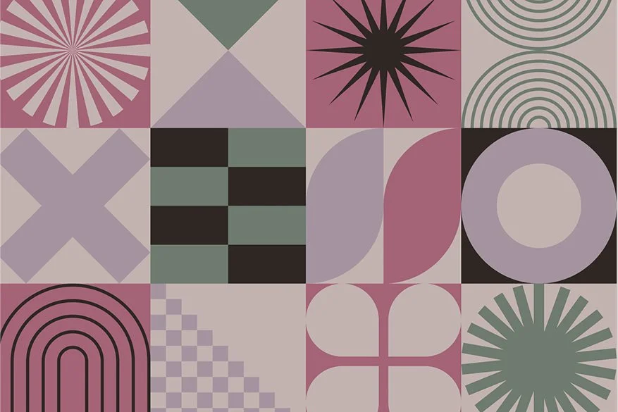
✅ More Neutrals with a Signature Pop
Modern brands often use neutral bases (beige, off-white, sand) layered with one surprising accent color—like electric cobalt or marigold. It keeps things versatile yet memorable.
How to Choose the Right Colors for Your Brand
Start with your audience, not your personal taste.
What do they need to feel? Safe? Inspired? Empowered? Ground your palette in emotion, not just aesthetics.Factor in your positioning.
Luxury or approachable? Fun or refined? Local or global? Color should reinforce the message you’re already sending.Think long-term usability.
Will this palette work across social media, packaging, website design, and print? Does it scale well in both light and dark mode?Test it live.
Mock up social posts, business cards, or landing pages. See how the colors behave in the real world, not just on a moodboard.
💡 Final Thought: Color Is Strategy, Not Just Style
The right brand colors don’t just “look good”—they work hard. They support your messaging, connect emotionally with your audience, and help you stand out in a crowded market.
In 2025, the brands winning attention aren’t the loudest; they’re the most intentional.
Need Help Crafting a Color Story That Converts?
If you’re building a brand or planning a refresh, I can help you create a color palette that not only reflects your brand’s personality—but attracts the right people. Whether you need a full visual identity or just strategic guidance, I offer custom packages for businesses ready to level up.
👉 Reach out to book a brand consultation or request a brand audit.
With over 20 years in the field, Cori Z. Vallone has a deep understanding of visual communication, branding strategies, and marketing trends.